The words
Give each line room
Preview a fast verse in full. Shorter lines and a clear typeface make the words easier to follow. Check the transition into the chorus too.
Your words, loads of ways to move
Fast verses. A chorus that needs the whole screen. A quieter line with room to breathe. Find the look that feels like your song.
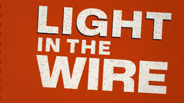
bold
Broadside looks like a gig poster pulled from a print shop. Thick wood-type letters meet a small set of inks, with your cover worked into the paper.
Watch the example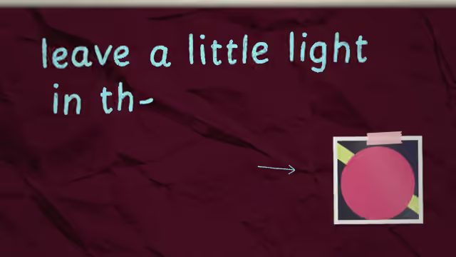
handmade
Diary gives the song a page of its own. Handwritten lines sit among notebook details, with your cover taped into the scene.
Watch the example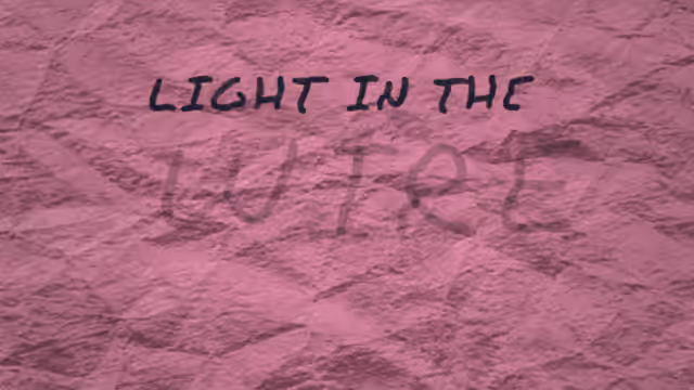
handmade
Marker writes with the weight of a felt-tip pen. Letters come forward with the line, while rough marks and doodles give the page a handmade rhythm.
Watch the example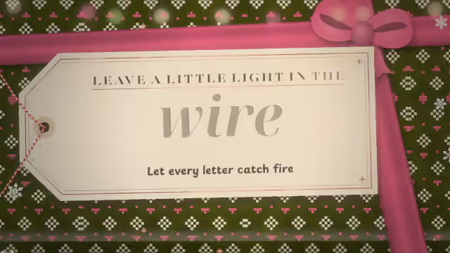
handmade
Workshop sets your song on a Christmas craft table, a bit like Santa's workshop. Every line is cut, stamped, foiled, stitched or knitted as it is sung, under a warm lamp and fairy lights.
Watch the example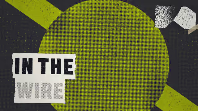
handmade
Words arrive on torn paper strips, a line at a time. Xerox turns your cover into photocopy texture and gives the chorus a change of light.
Watch the example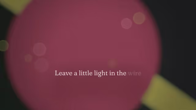
cinematic
A printed line with a handwritten afterthought. Postscript pairs serif lettering with script emphasis, against a soft, shifting view of your cover.
Watch the example
cinematic
Let the artwork carry the atmosphere. Widescreen moves gently through your cover while the words stay clear in front of it.
Watch the example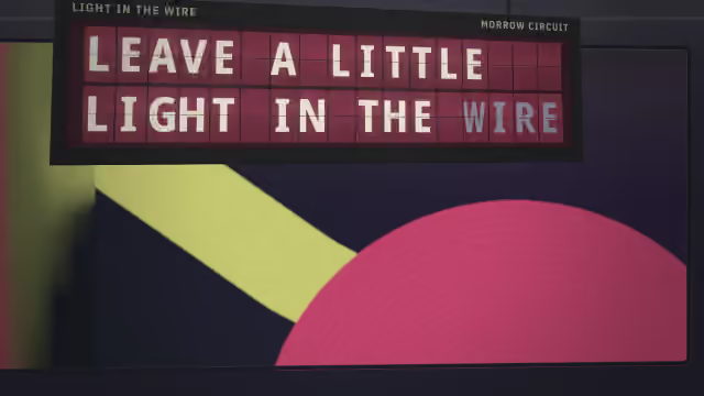
retro
Departure turns a lyric into a destination board. Flipping characters and glowing signs give each line the rhythm of an arrival or a departure.
Watch the example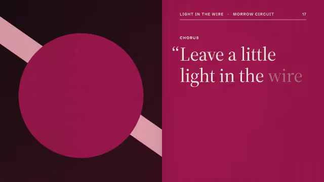
minimal
Folio treats a line like a pull quote. Your cover becomes part of a magazine spread, with a clear hierarchy between the words and the picture.
Watch the exampleFast verses suit short, moving groups of words; a big chorus wants more of the frame. A person on the cover? Check which styles use the cut-out. Then let the preview decide.
The words
Preview a fast verse in full. Shorter lines and a clear typeface make the words easier to follow. Check the transition into the chorus too.
The look
Try bold type against a simple cover, or let a quieter layout give the image more space. Change the available colours and fonts until the song and picture feel at home together.
The format
Landscape and portrait need different room around the lyrics. Compare both examples, then check that your own words stay clear in the format you want to share.
Try each typeface on a dense line and a quiet one, keep contrast against the artwork, and check a phone screen before you export. Your song’s letters decide which fonts are available; each style page lists its current controls.
Yes. Each style has its own choices. Open a style page to see the current controls.
A style can depend on the cover or the letters in your lyrics. The editor explains why an option cannot be used.
No. The suggestions are a starting point. You can try the other available styles before downloading.
Yes. Add your cover art, then see how the available styles use its image and colours. Each style treats the artwork differently, so preview it with your own track.
Check a fast verse as well as the chorus. Choose a clear font, leave room around the words and make sure the text stands out from your artwork.
They use different layouts to fit the frame. Watch both formats on a style page, then check your own preview before choosing a download.